Hairsss
Full Scope Brand and UX Design for a Luxury Medical Hair Clinic
Hairsss is a Swiss based luxury hair clinic offering advanced medical treatments such as PRP, mesotherapy, and exosome therapy to address hair thinning and loss. This was a project I created entirely from scratch, from naming and branding to UX design, content strategy, and launch. The goal: Create a trustworthy, luxurious, and medically credible brand that could educate and convert a non expert audience through a seamless, emotionally resonant digital experience.
Before starting any design or branding decision, I conducted a comprehensive competitive analysis of clinics offering similar hair treatments in Switzerland and Europe. I selected both direct competitors (medical aesthetic clinics specializing in hair treatments) and indirect competitors (general skincare/aesthetic clinics that include hair services as part of their offerings). Clinics such as Clinique Matignon, Skinmed, Dr. Legrand, and Aesthea were among the primary benchmarks.
The analysis focused on several key criteria: visual branding, website usability, content clarity, booking experience, and emotional tone. Many of the competitors leaned heavily on either overly medical or overly luxury aesthetics, creating a barrier for users who needed human connection and approachability. Websites were often cluttered, with overwhelming text and outdated layouts. The user flow to book an appointment was often buried under multiple clicks or confusing dropdowns.
From this analysis, I identified several opportunities for Hairsss:
To validate assumptions and align the brand with real user needs, I conducted a set of user interviews with a sample of 5 individuals. All participants were between 25 and 50 years old, based in Switzerland, and either had experienced hair loss or had considered medical hair treatments in the past year.
The participants were recruited via personal networks. Interviews were conducted in both French and English, over google meet or in person, and each lasted about 30–45 minutes. The approach was semi structured, allowing space for follow up questions depending on the user’s responses.
Several common themes emerged from the interviews:
.png)
These interviews were foundational in shaping the tone, design, and overall user experience of Hairsss.
From the qualitative insights gathered through interviews and the quantitative findings from Google Trends, Swiss SEO tools, and competitor reviews, several clear conclusions shaped the direction of the project:
These findings fed directly into the information architecture, copywriting tone, and branding direction of Hairsss.
From the research, I created 2 detailed user personas:


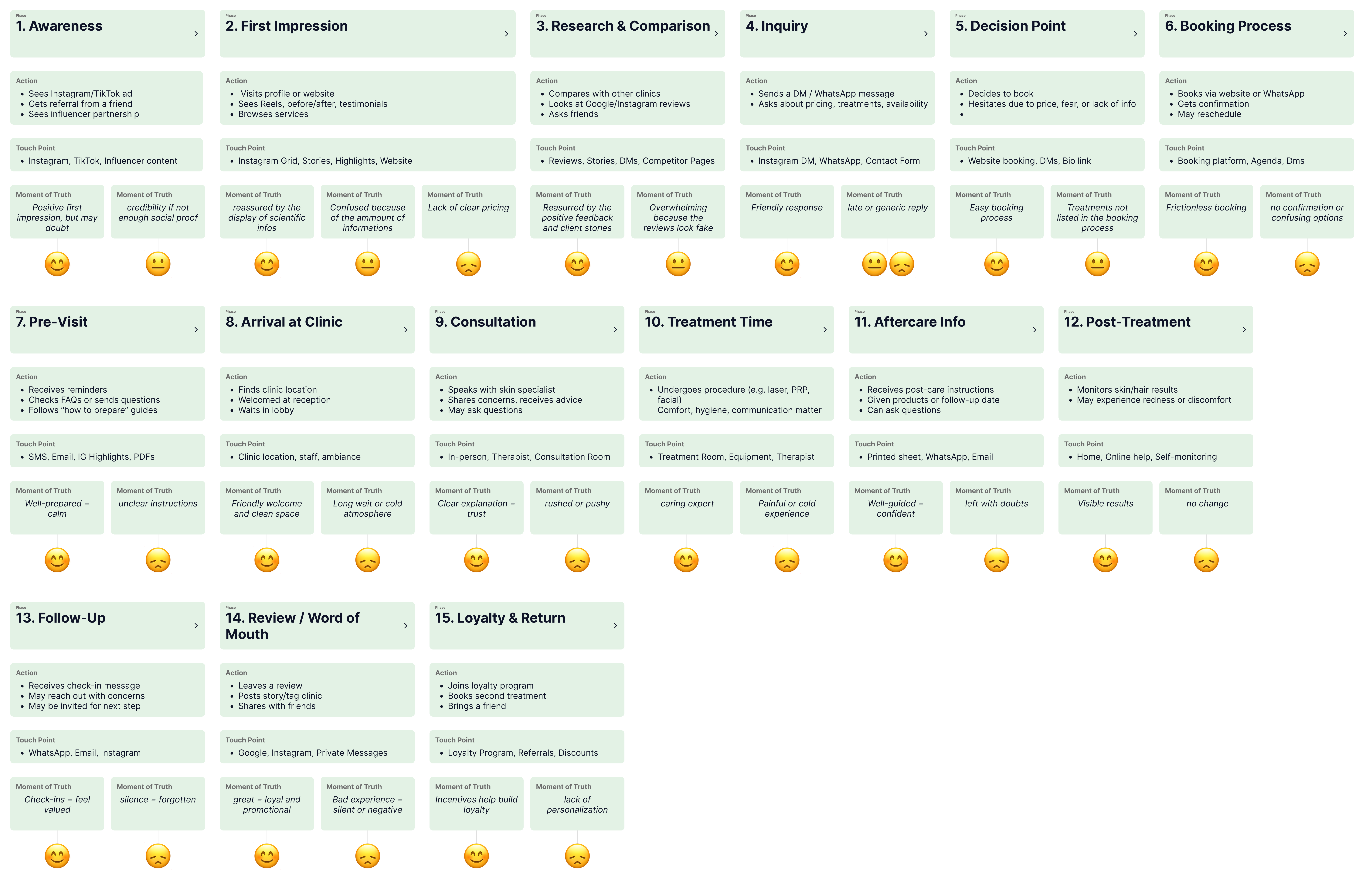
To better understand the emotional and practical needs of Hairsss users, I created a detailed empathy map. It revealed that most users feel overwhelmed, insecure, and skeptical due to past failed hair treatments and lack of trustworthy information. While they are hopeful, they need clear guidance, visual proof, and emotional reassurance. This insight helped shape a user journey focused on trust, education, and personalized care — ensuring the brand speaks directly to their fears, goals, and motivations.
To design a truly user centered experience for Hairsss, I mapped out the complete user journey from the moment clients become aware of their hair loss to the end of their treatment. This journey revealed that users often begin in a state of emotional distress, feeling confused, insecure, and overwhelmed by misinformation online. As they explore options, they seek clear explanations, real proof of results, and reassurance from qualified professionals. Booking a consultation can feel intimidating, so users respond best to friendly, human touchpoints like WhatsApp communication and transparent service details. Once treatment begins, their emotional state shifts toward hopefulness, but they continue to crave guidance, visual progress tracking, and supportive follow up. By understanding these emotional and behavioral shifts, I was able to design a seamless experience that builds trust, simplifies decision making, and empowers users to feel confident throughout their entire journey with Hairsss.
With the insights gathered, I began the brand design process from a blank slate. Hairsss needed to feel clean, calming, trustworthy, and premium, while avoiding the clinical coldness seen in other competitors.
The brand strategy was built around four core values: Trust, Care, Expertise, and Natural Growth. These values informed every design decision, from the logo to the button hovers.
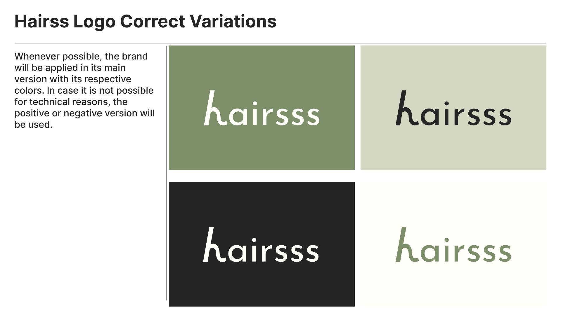
The final logo features a soft, organic serif typeface combined with a delicate graphic element evoking hair strands and natural flow. It subtly combines elements of clearness and professionalism. Alternate versions were created for dark/light backgrounds and social media uses. Keep in mind that the owner of the beand specified that they want the logo to look exactly like SSSKIN logo, a clinic that specialised in laser hair removal since they are partners.

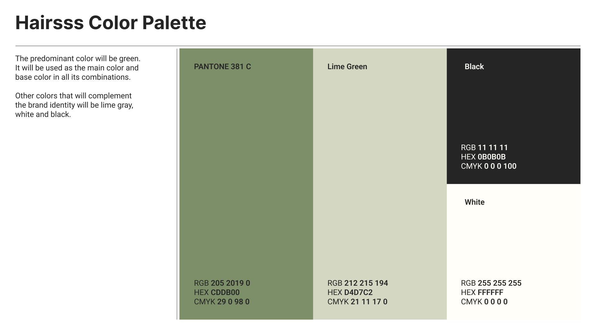
A soft, neutral color palette was chosen: creamy beige, soft white, sand, and warm gray—evoking calmness, cleanliness, and natural health. A hint of muted gold was used sparingly to reinforce premium quality without overdoing it.
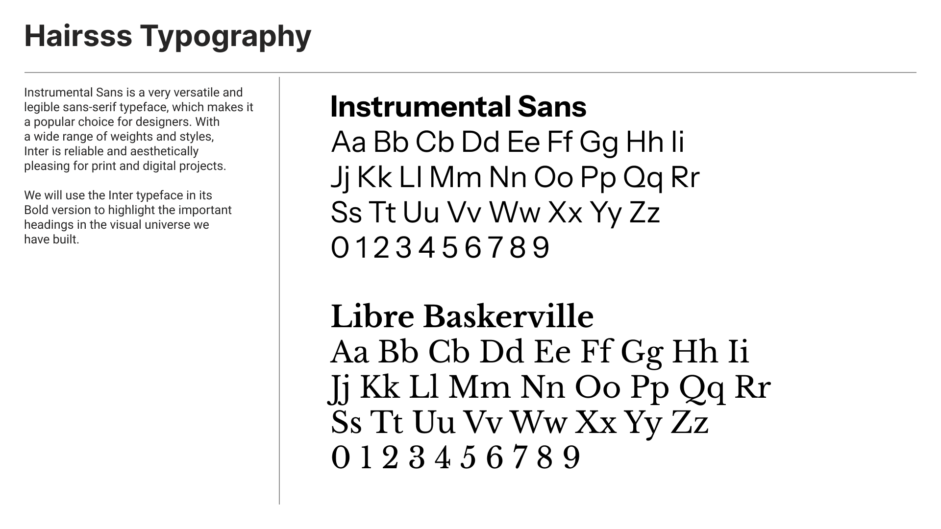
I selected a modern serif font for titles (reminiscent of editorial beauty brands) and a clean geometric sans serif for body copy, ensuring both legibility and elegance across all mediums.
The goal of the Hairsss project was to support business growth by increasing visibility and bookings through a modern, user friendly platform. The project focused on creating a clear, trustworthy brand and an intuitive website that made it easy for users to understand treatments and book consultations. By aligning business objectives with user needs, we created a seamless experience that builds trust and drives conversion.
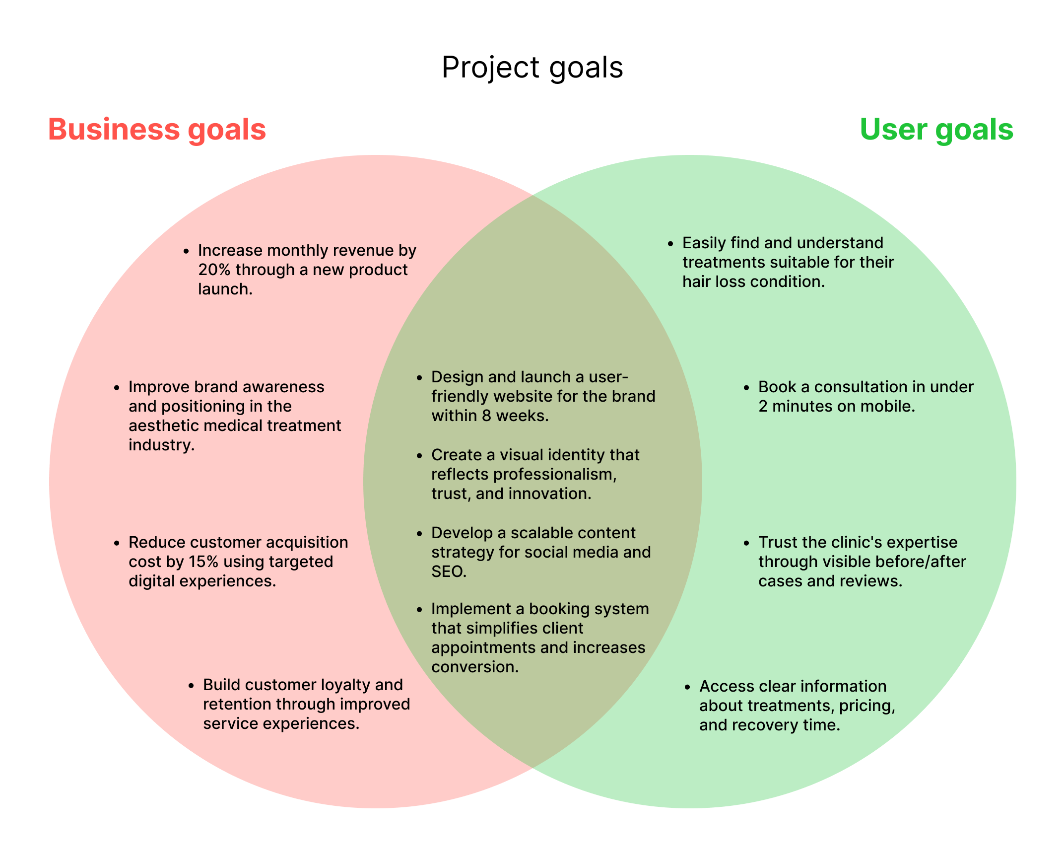
The feature roadmap was organized into four categories to guide development priorities. Must have features focused on core functionality, including a responsive website, service pages, and an online booking system. Nice to have elements like FAQs, multilanguage support, and a blog added extra value and trust. To create a standout experience, we included surprising and delightful features such as a personalized treatment quiz and smooth micro animations. Finally, can come later features like an ecommerce section and loyalty program were reserved for future growth and scalability.

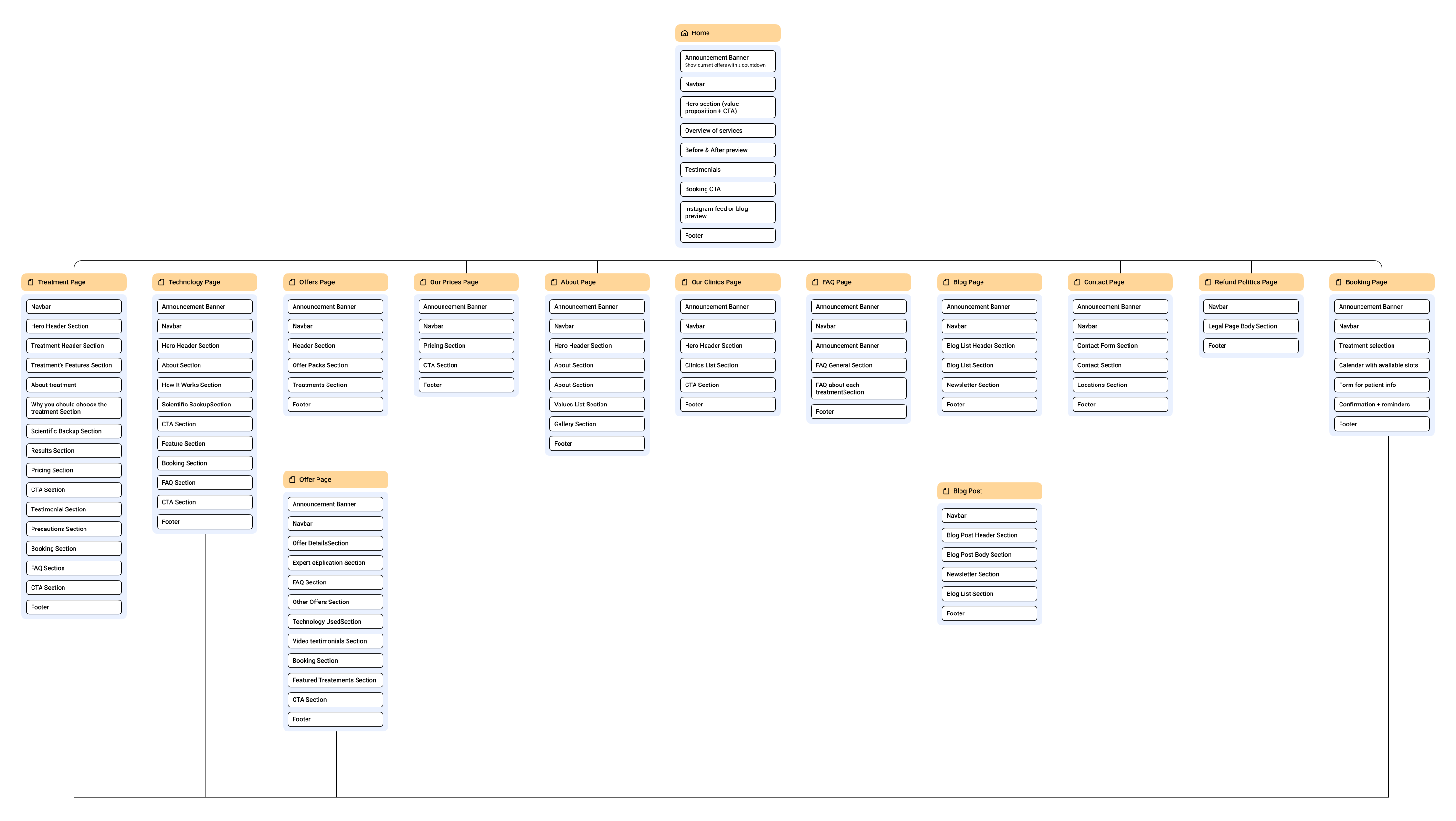
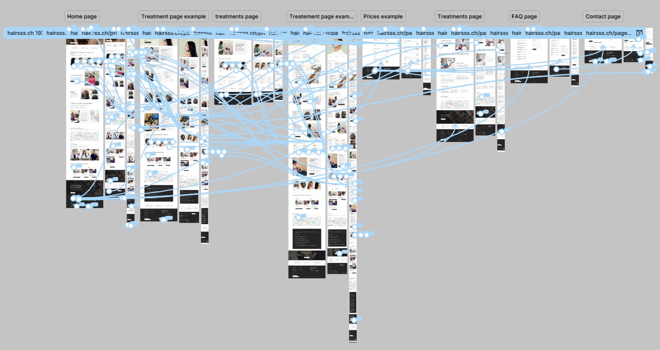
The information architecture of Hairsss was designed to provide a seamless and intuitive user experience. It starts with a clear homepage that introduces the brand and leads users to key areas such as treatments, booking, and results. Dedicated pages for each treatment offer detailed insights, while a structured booking flow ensures easy appointment scheduling. Supporting sections like FAQs, testimonials, and contact information build trust and address user concerns. This structure ensures that users can find what they need quickly, while also supporting the brand’s credibility and conversion goals.
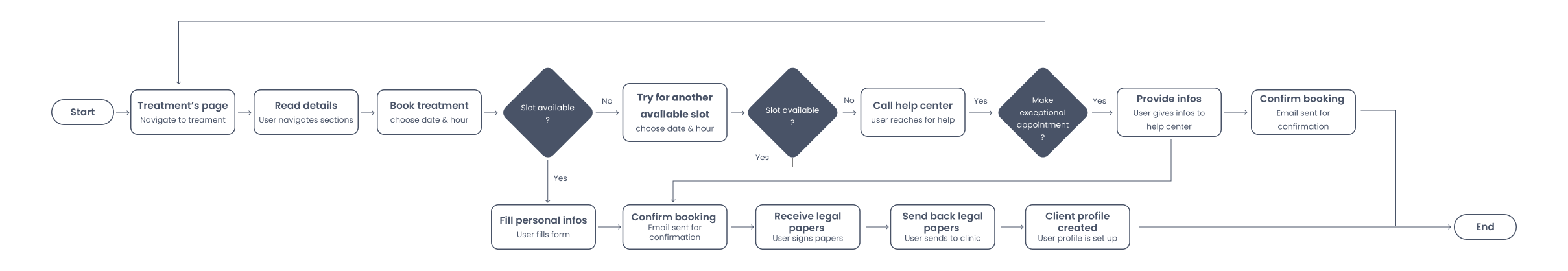
The user flows for Hairsss were designed to guide visitors smoothly from discovery to conversion. Whether users are exploring treatments, viewing real results, or booking a session, each flow minimizes friction and builds trust. The primary path leads users from the homepage to treatment pages and directly into a simplified booking system. Supporting flows like FAQs, contact, and testimonials ensure users feel informed and confident at every step.

During the wireframing phase, I focused on creating a clean, intuitive layout that prioritized clarity and ease of navigation. I developed low fidelity wireframes for key pages such as the homepage, treatment pages, booking flow, and results gallery. These wireframes helped me define the content hierarchy, user journeys, and interaction points before moving into design.
PS: At this stage, the project owners decided to integrate Agenda.ch as the booking system, as it is widely trusted within the Swiss community, particularly in the medical field—offering reliability and familiarity for the target audience. My goal was to ensure a seamless experience across devices, with clear CTAs and accessible information guiding users toward booking.

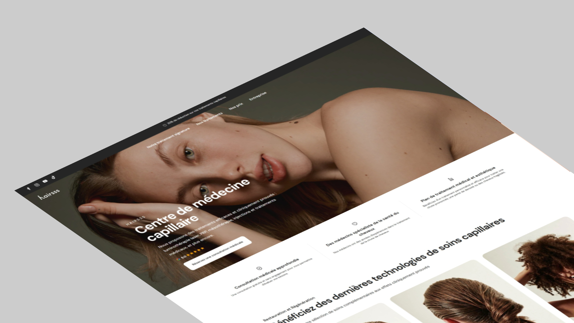
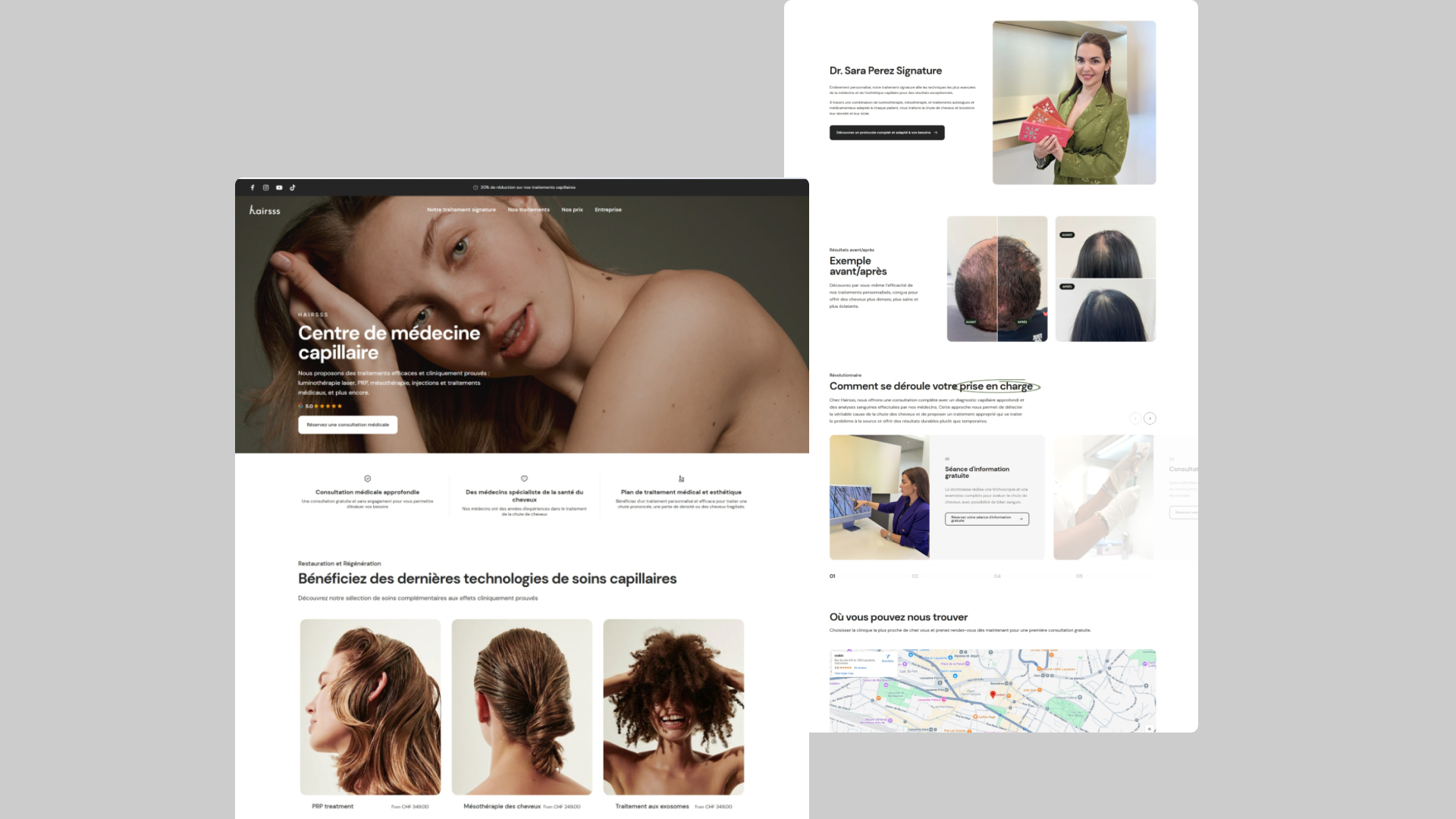
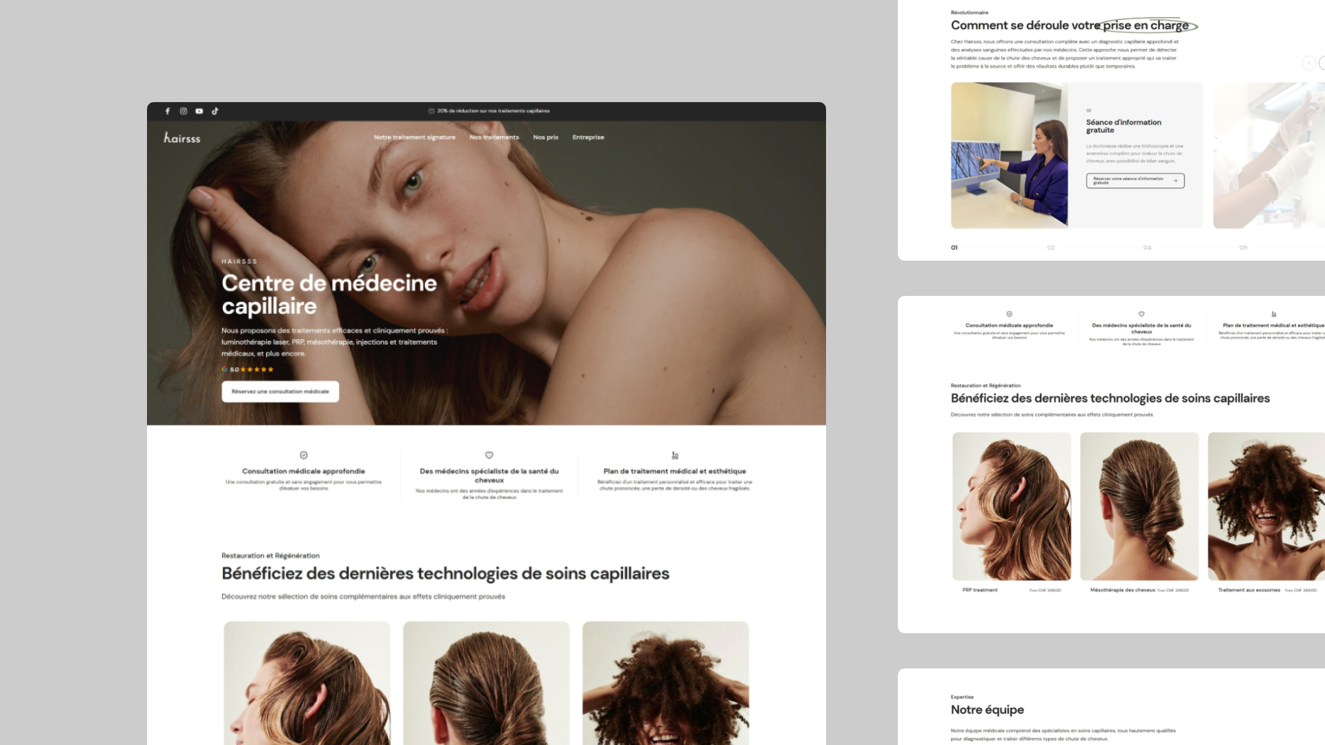
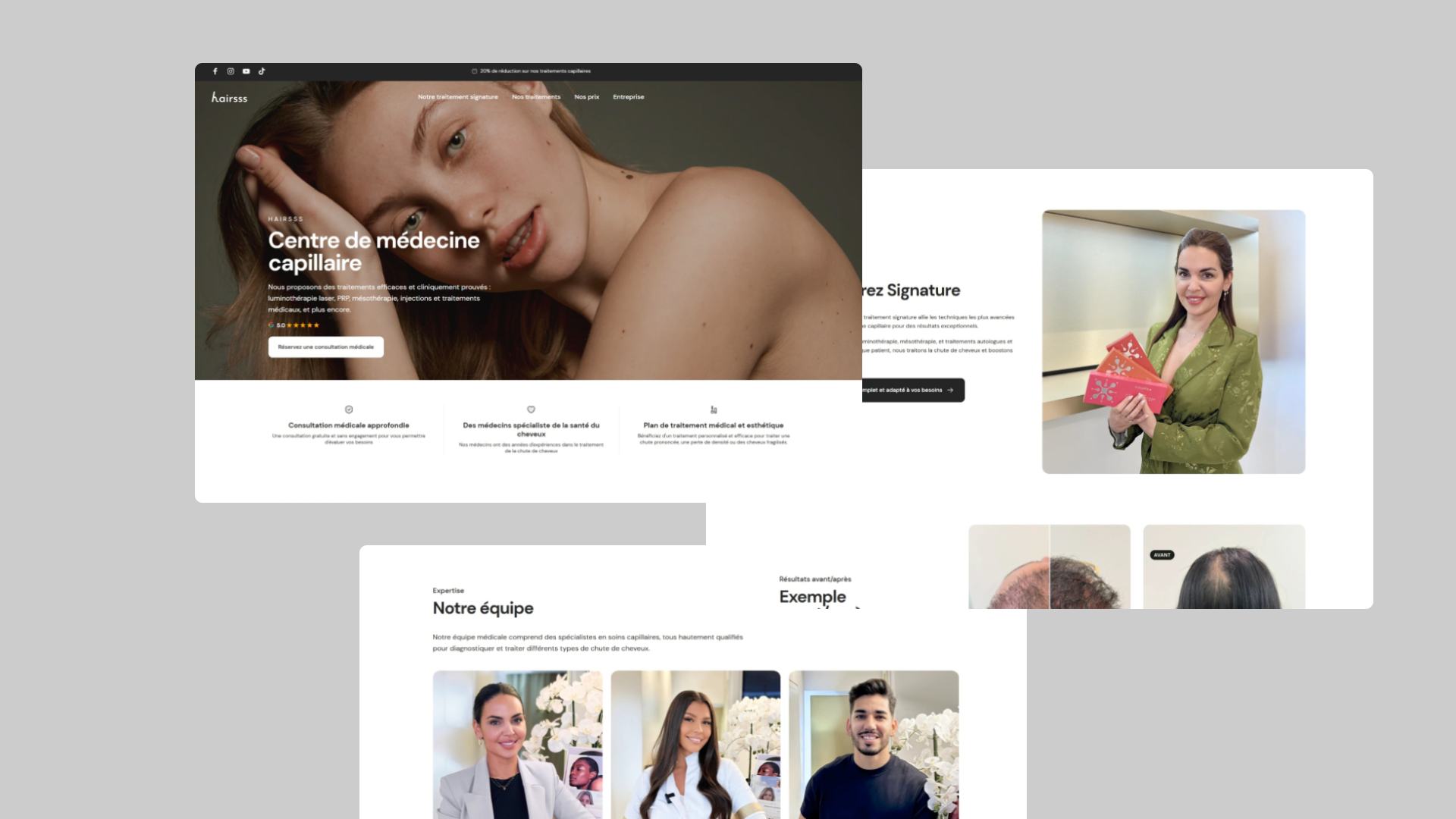
In the UI design phase, I translated the wireframes into a clean, elegant visual interface that reflects the professionalism and trustworthiness of the Hairsss brand. I focused on soft, medical inspired colors, clear typography, and calming visuals to create a sense of care and confidence. Every element was designed with usability in mind, ensuring that users could navigate easily, access key information quickly, and feel guided throughout their journey. The interface also highlights real results and testimonials to reinforce credibility and encourage bookings.
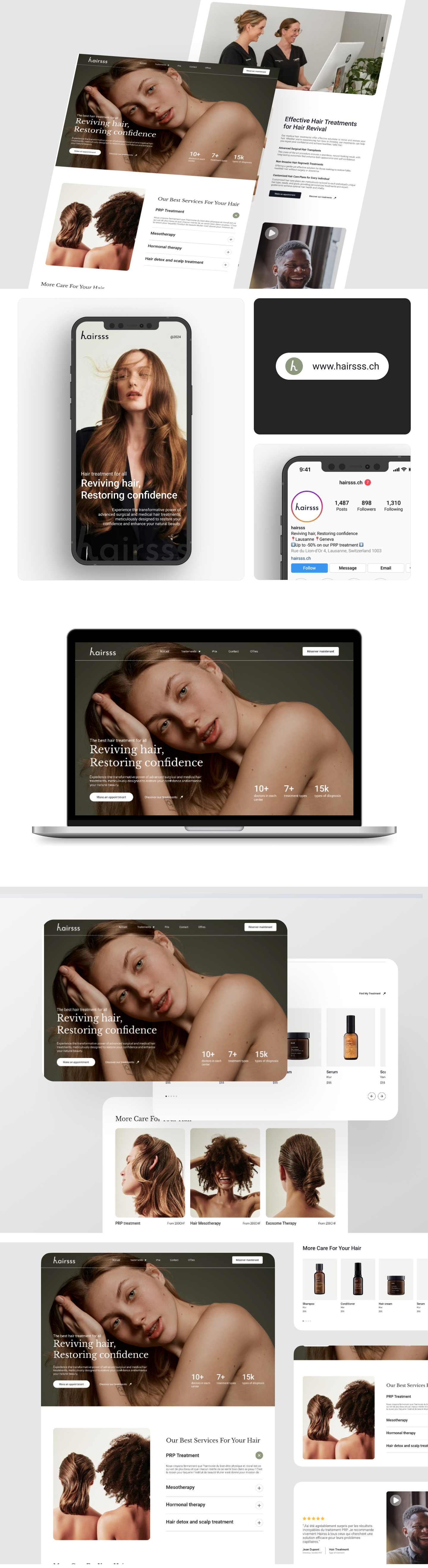
After incorporating key features and aligning the design with what users truly want and need, the final interface now looks something like this:
Once the UI design was finalized, I moved into the prototyping phase to bring the interface to life and simulate real user interactions. Using Figma, I created an interactive prototype that allowed stakeholders to test the user flows—especially the treatment exploration and booking process. This step was essential for identifying usability issues, ensuring smooth transitions, and validating the overall experience before development. The prototype also helped the doctors and project owner visualize how the platform would function in a real context and provided a clear foundation for developer handoff.
Once the prototype was finalized in Figma, I conducted remote usability testing with 6 participants (3 new users, 3 repeat testers from earlier interviews). Each participant was asked to perform tasks such as:
After analyzing the feedback, I made several refinements:
Working on Hairsss was a valuable experience in building a service based brand from the ground up using Shopify. One key takeaway was the importance of aligning user needs with medical credibility, every design and content decision needed to not only be aesthetically pleasing but also trustworthy and reassuring. I learned how to blend branding, UX, and conversion strategy into a seamless flow that guides users from curiosity to booking. Integrating external tools like Agenda.ch also taught me how to create a smooth, hybrid experience between Shopify and third party services. Overall, the project reinforced how good design isn’t just visual, it’s strategic, functional, and user centered.
One of the main challenges in this project was adapting Shopify, a platform traditionally used for ecommerce, to suit the specific needs of a medical service provider. Structuring treatments as "products" required creative use of metafields and custom sections to deliver information clearly without confusing users. Another challenge was maintaining the balance between medical professionalism and a welcoming, approachable tone especially in visual design and content. Collaborating with medical professionals also meant frequent iterations to ensure accuracy and compliance, especially in how treatments were described. These challenges pushed me to be both flexible and detail oriented, and they ultimately led to a stronger, more thoughtful outcome.