Artinox Website
A metallic constructor managment website
Artinox is a distinguished company specializing in the creation of metallic constructions, renowned for its expertise in crafting high-quality and innovative metal structures. With a commitment to precision engineering and a keen eye for design, Artinox has established itself as a leader in the industry.
Artinox excels in producing a diverse range of metallic constructions, including but not limited to architectural elements, industrial frameworks, and bespoke metal solutions. Known for its meticulous attention to detail, Artinox ensures that each project meets the highest standards of durability, functionality, and aesthetic appeal.
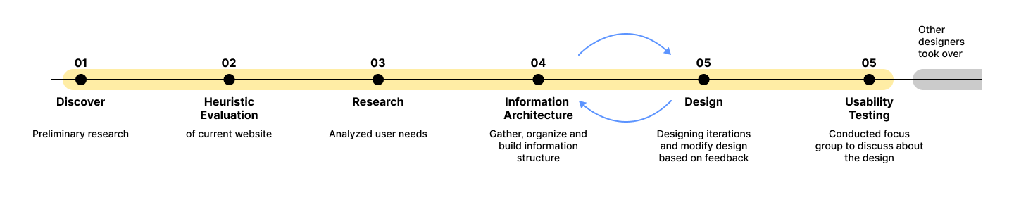
When I joined in this project, one of their designers had already checked if the initial user profile (proto-persona) made sense. I looked at the data from that research and figured out what users really wanted by using a colorful sheet based on group discussions. Then, I organized how information should be arranged and created basic layouts to make sure users could find everything easily. After that, I designed the first version with the main features and tested it with users to improve the design based on their feedback.
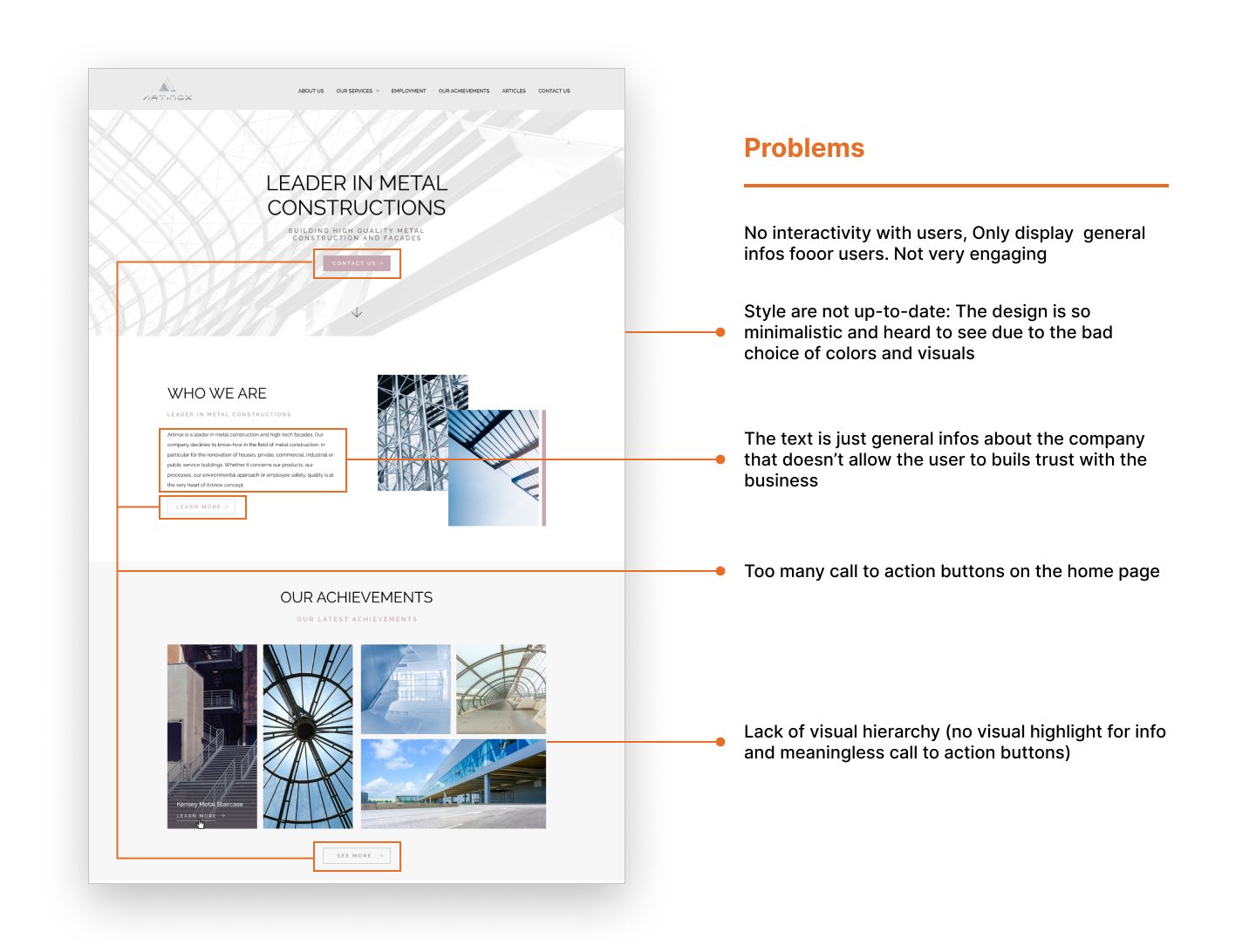
First of all, I did the heuristic evaluation for the previous Artinox website to understand all the problems. One of the most serious problem is that the website is lack of interactivity. There is even no heavy user for the website.
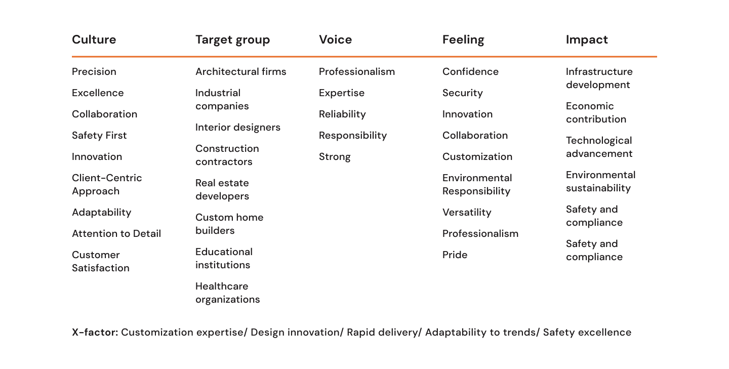
Through brainstorming and organizing brand attributes into different categories, I laid the groundwork for developing a mission statement, and this process took approximately 30 minutes.
Culture How would our community describe us?
Target Groups How would Artinox describe their target audience?
Voice How do Artinox want to sound to others?
Feeling How do others feel after being in contact with Artinox?
Impact What tangible impact do Artinox have on others?
X-Factor How can Artinox different from others?
In this instance, the primary objective was to collect information to shape the upcoming website design and facilitate unbiased discussions around it. However, this exercise has versatile applications, such as establishing the criteria through which marketing copy should pass (voice attributes) and determining its key focus (x-factor).
To better understand the diverse user groups, I created proto-personas rooted in experience and assumptions. These proto-personas act as an initial framework, enabling us to contemplate user needs, challenges, and potential solutions as I progress in constructing the information architecture.
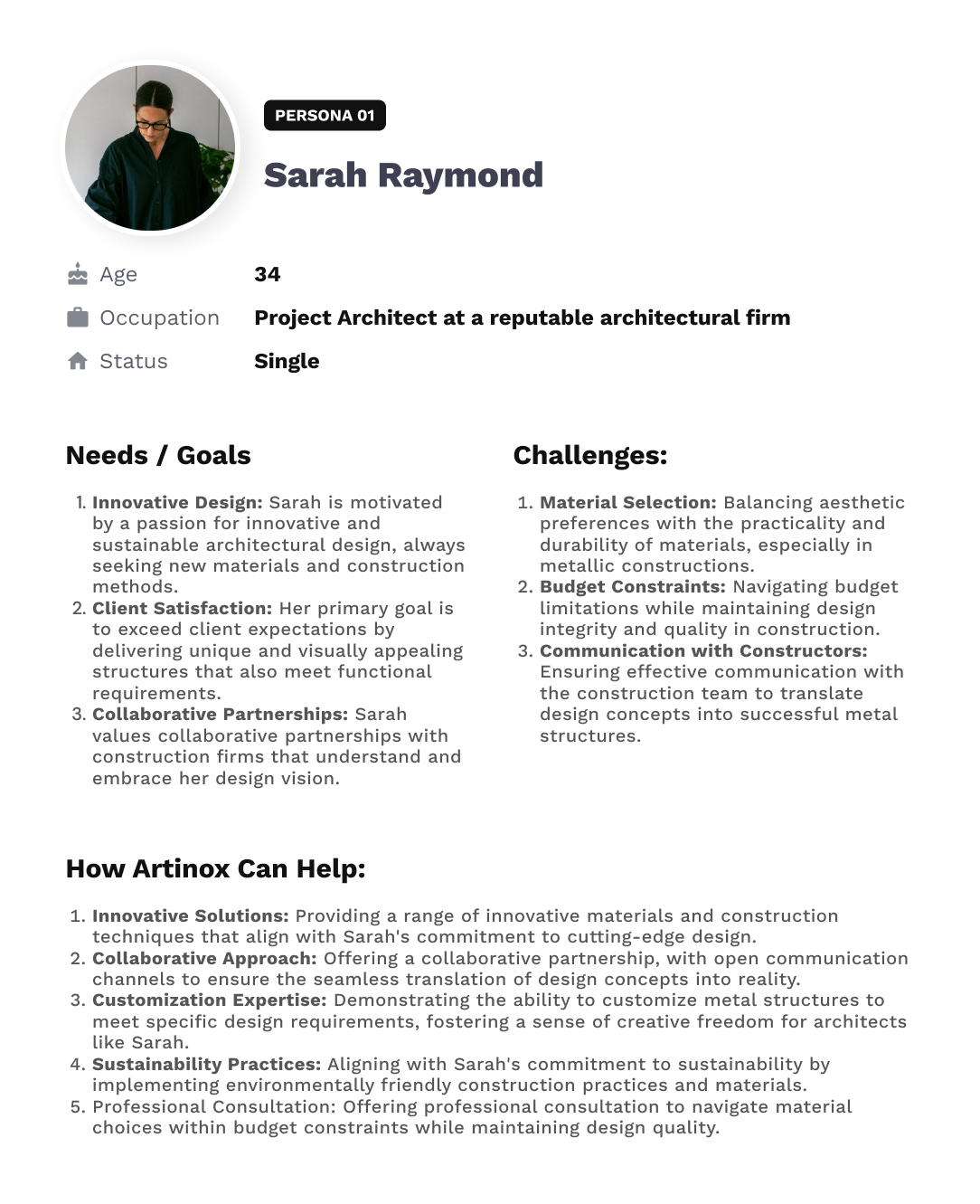
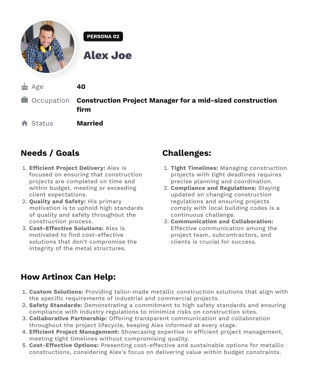
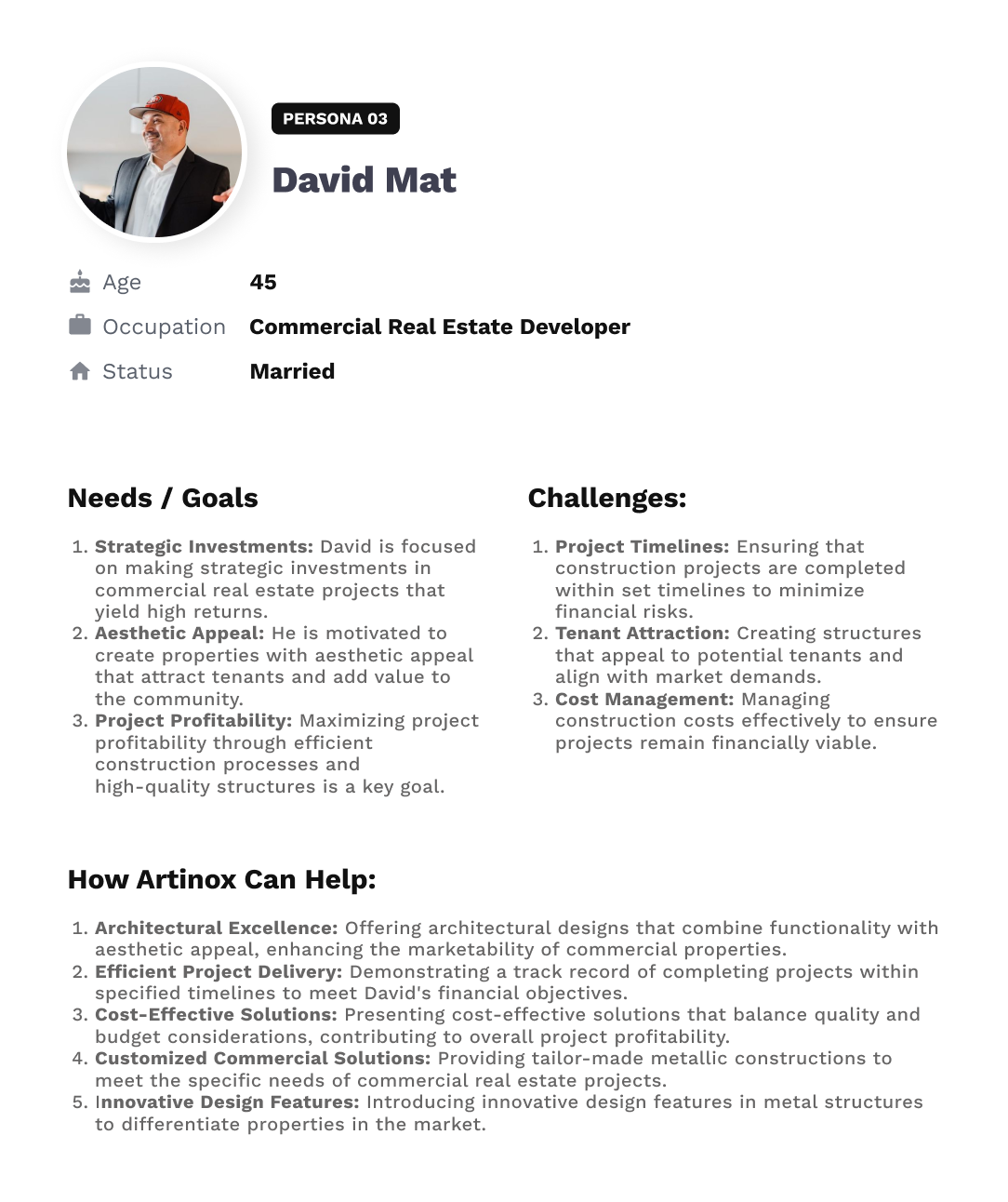
I established fundamental design objectives derived from user input. Our overarching aim is to create a platform that is engaging, efficient, and user-friendly, especially after knowing that our main targets prefer what is easy, quick and also reflects aesthetics.
To figure out what's on the old website, I made a list of all the stuff it has – like information and features. Then, I decided what I want to keep, what I don't need anymore, and how to organize everything in a way that's easy to understand.
When working on the sitemap, I considered the different user profiles I came up with and thought about how to solve their problems and meet their needs. I also kept in mind the goals of the organization.
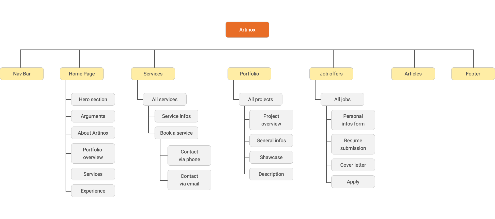
I made simple sketches of how the website could look. This helped everyone understand and agree on the basic layout.
Looking back, to previous projects and designs, some flows and pages are mostly just generic, the business owners asked for a very simple looking contact and job offer page, which led me to not focus on them since they don't require much work. Which at the end didn't end up with a pleasing result. Next time, I'll try a different way where I focus more on main pages and still give time to less important ones, even if the team asked me to skip on them due to short schedule or any other reasons.
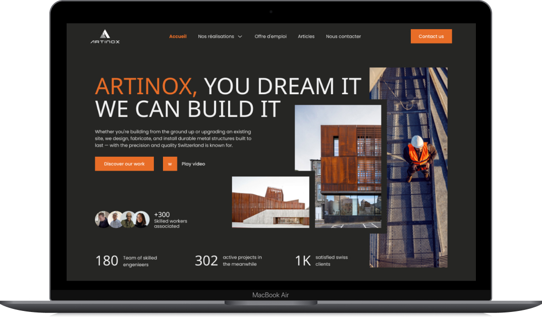
I finished putting everything together! You can see how the website looked here and here before they changed it.
Due to the in depth research, there were hardly any required revisions, neither in information architecture nor in visual design.
As a learning: Make sure to really (I mean, really really) get the expectations of the group right and to clearly communicate the exact goal of the individual exercises – I thought I did so, but I felt a lack of understanding here and there.
The website will be implemented using WordPress, and since I didn‘t know about this detail till the very end of the project, some concepts were way more complex to implement, respectively way more complex to maintain by the client. Generally – and as I‘m able to do so – I would prefer to keep up the fast pace of the process by developing the website myself and being able to adjust little details without too much effort.